Meijer
Role
Me - Senior UX Designer
Pablo - Design Lead
Joseline - Scrum Designer
Sierra - UX Research
Problem
As the covid restrictions began to ease in 2022, store traffic began to pick up but still there were still goals to increase online sales. Pablo was new to this team, but he brought fresh perspectives and ideas. We were having our 1 on 1 and the topic of the homepage came up and how there was no logged in state, he then pitched the idea that this is a great opportunity to run a design sprint. One he saw this a great growth opportunity for me to help run one and two Meijer was still new in terms of UX maturity and there was a need to reach across the existing silos and work as a team.
Planning
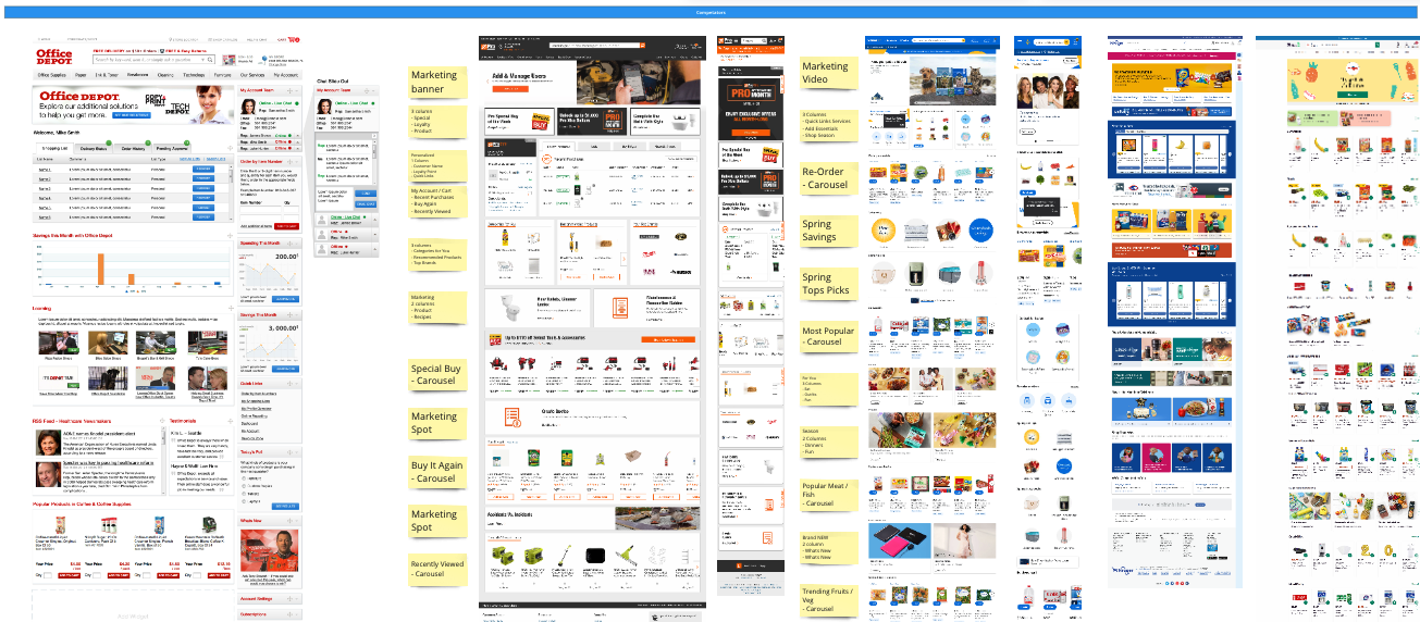
To prepare for the sprint we enlisted the help of Sierra to run the stakeholder interviews. While that was going on, I was tasked with getting the competitive analysis assembled.
Day 1 - Overview
The goals for the first day were to set the context of why we are here, review the our findings in the stakeholder interviews and then use the competitive analysis to allow everyone in the meeting to craft their own ‘how might we’ statements.
The day would wrap with the team organizing and voting on the top issues shown below.
mPerks is Meijers loyalty program that customers participate in to collect rewards and customized coupons.
Note: Since this day involved a lot of high level stakeholder feedback, it is best that I keep this section brief. While I did review the competitive analysis to the group, I was on the schedule for days 2 and 3. That said I am more than willing to screen share the full Miro board.
Day 2 - Time to Sketch
Going into the second day, we took some time to review the “How Might We” themes for the statements and then after describing what the Crazy 8’s concept was to the group. We set the timer and got to sketching. The miro board below has the results.
Every one took their turns discussing their ideas. We then let everyone vote on areas that caught their attention and after a grouping exercise, we had our general themes for the design.
Day 3
There were a few strategic tweaks we made to this design sprint because this was new to most of the internal stakeholders. That said, having lo fidelity sketches at the end of the sprint were not going to cut it. In order to really get buy in on the concept and approval to keep doing these, we scheduled Day 3 with a buffer so that Joseline and myself could have 2 days of heads down time to take the concept to as high of a fidelity that we could.
We had 4 themes emerge:
mPerks needed priority
a solution for online order tracking
ways to offer personalized buy again
respect marketing and be sure to account for their ad space.
We then reviewed the design below with the group to very positive feedback. Marketing was relieved to see the amount of ad-space we intended, the mPerks top section was a hit with everyone and there was a lot of great discussion had with our order tracking widget. Once the group was content with the design direction we set out to run a user test with our customers.
Feedback and Lessons
Intial testing went well overall and being deliberate with the theme of saving money really resonated. We had a really great foundation for a concept and received approval to continue to work on the homepage redesign. Specifically to flush out the mobile view (sneak peak below) and to begin conversations of technical feasibility of the components.
I learned quite a bit from being a part of this. It was a great example of how including stakeholders in the design process can help break down organization silos. We were able to show the marketing team that we understand the importance of having ad space, and how we can make the design better for the user while still giving them plenty of opportunities to work with. But also as a designer, I learned that this is a lot of work to organize and set up, however it is worth it because I had a lot of fun and we produced a design artifact that I can be proud of.


